Project Phase One


These posters showcase the timeless designs of Danish architect and designer Arne Jacobsen. Jacobsen's designs are highly recognizable and iconic, which is why I chose to use their silhouettes in these posters. The color palette I used is inspired by Bauhaus design, as this school was a large influence on Jacobsen's design style.
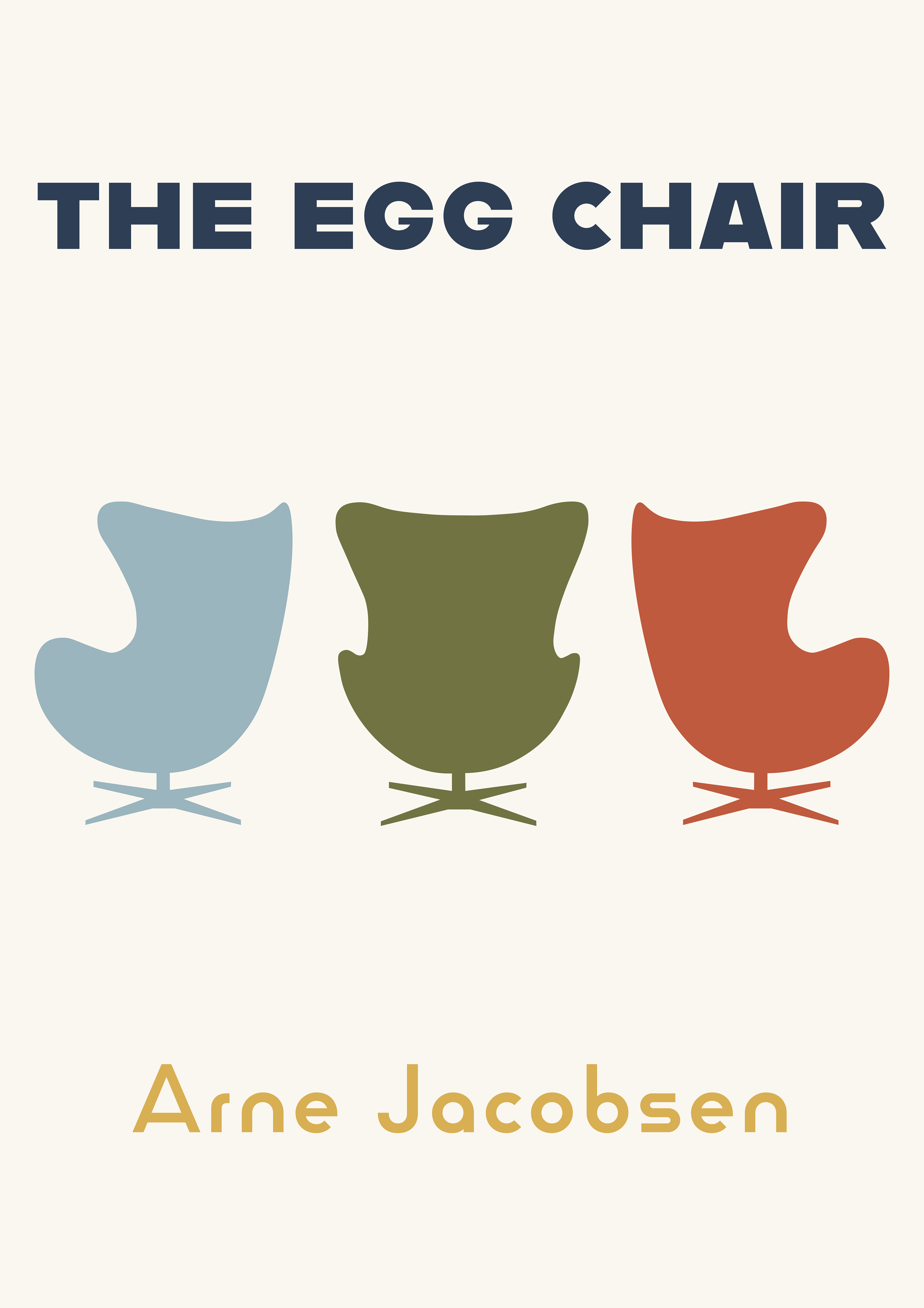
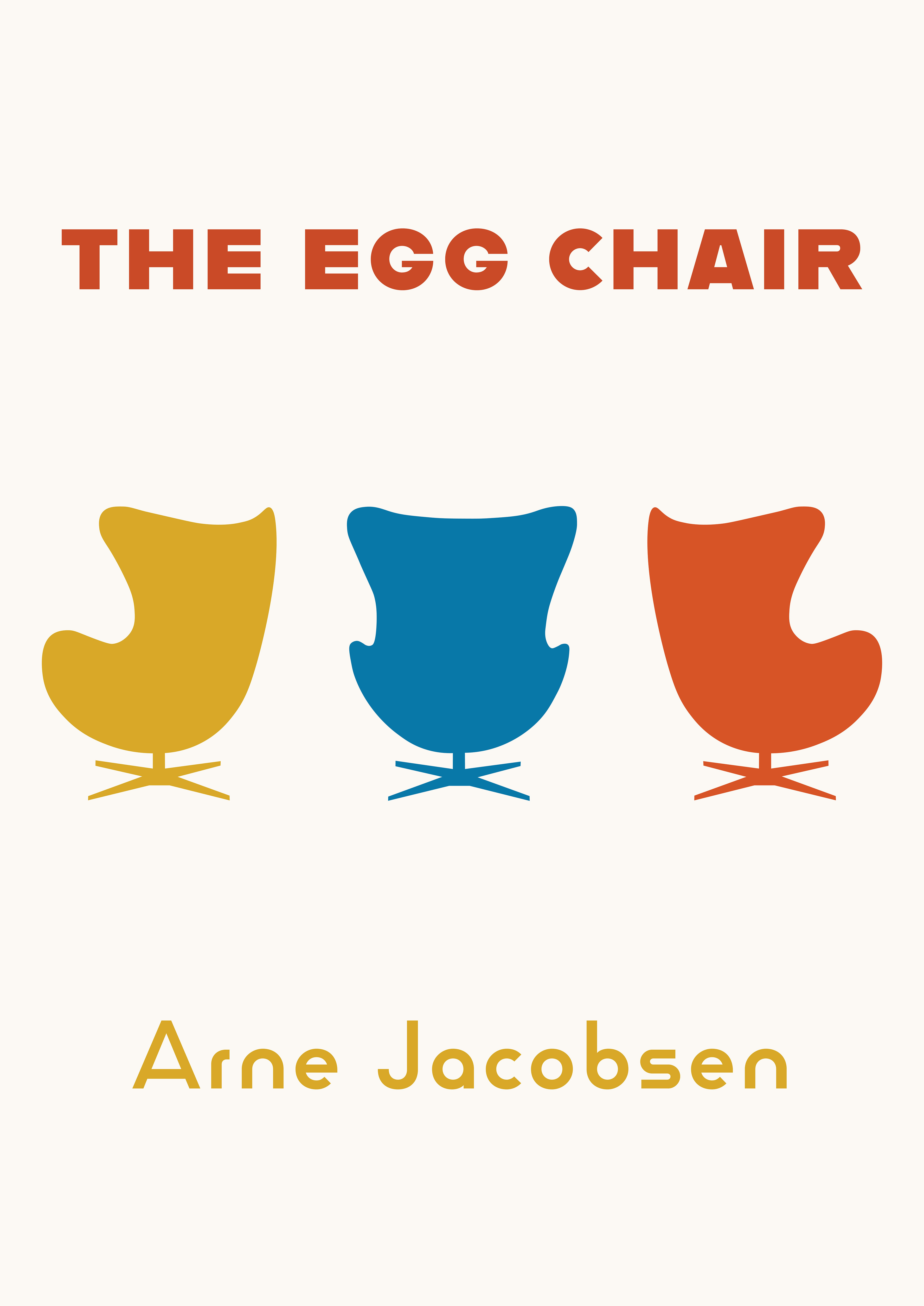
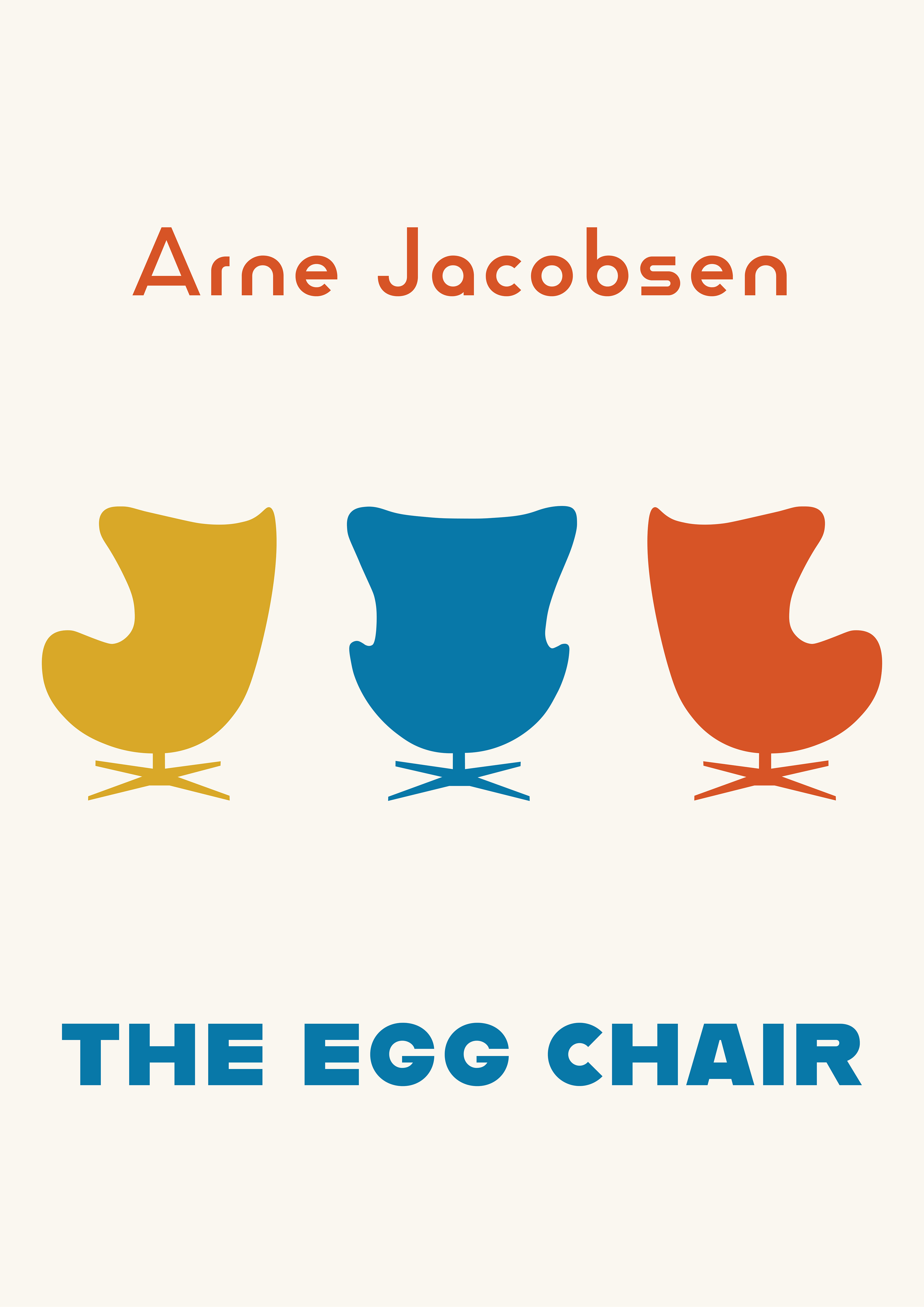
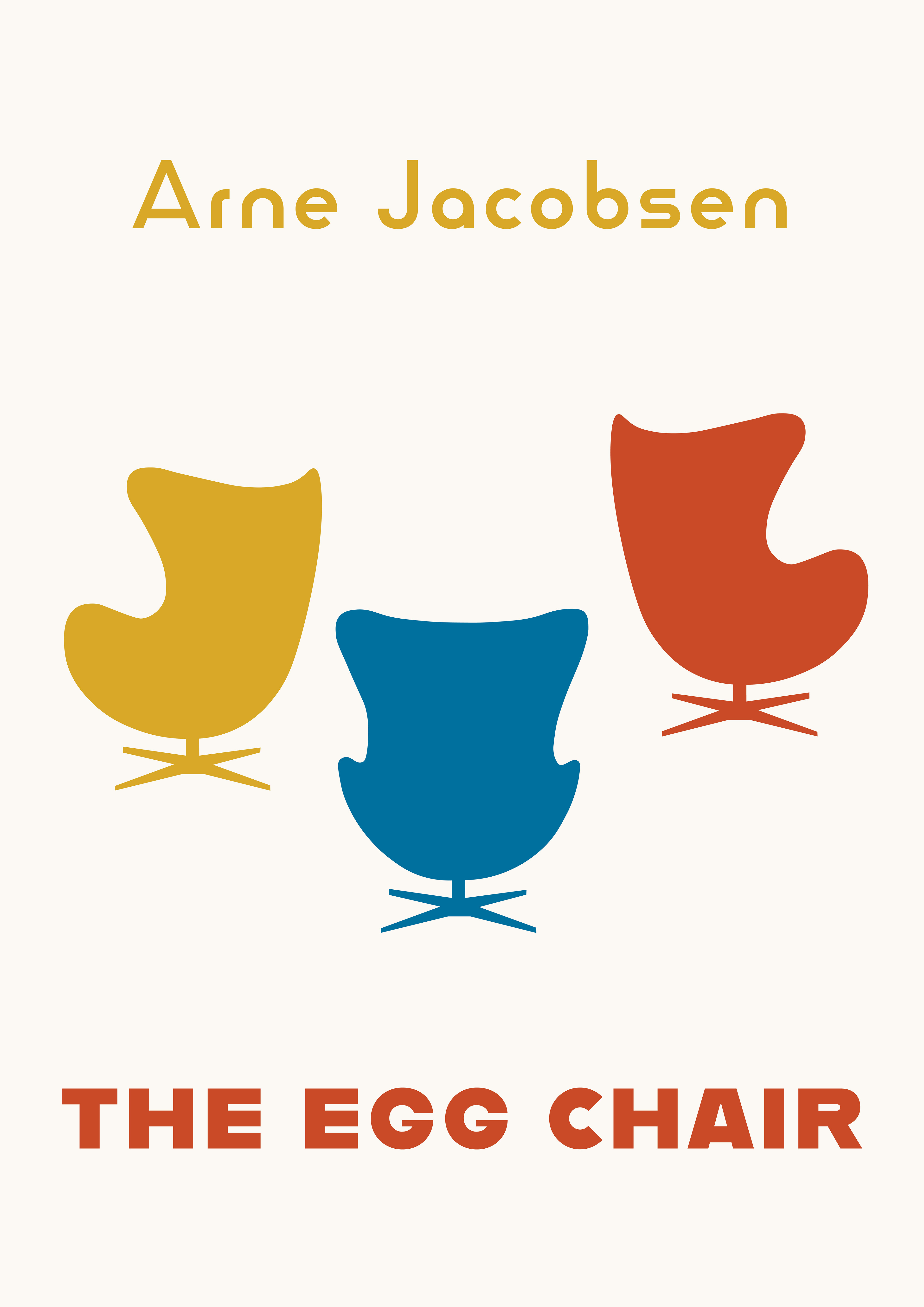
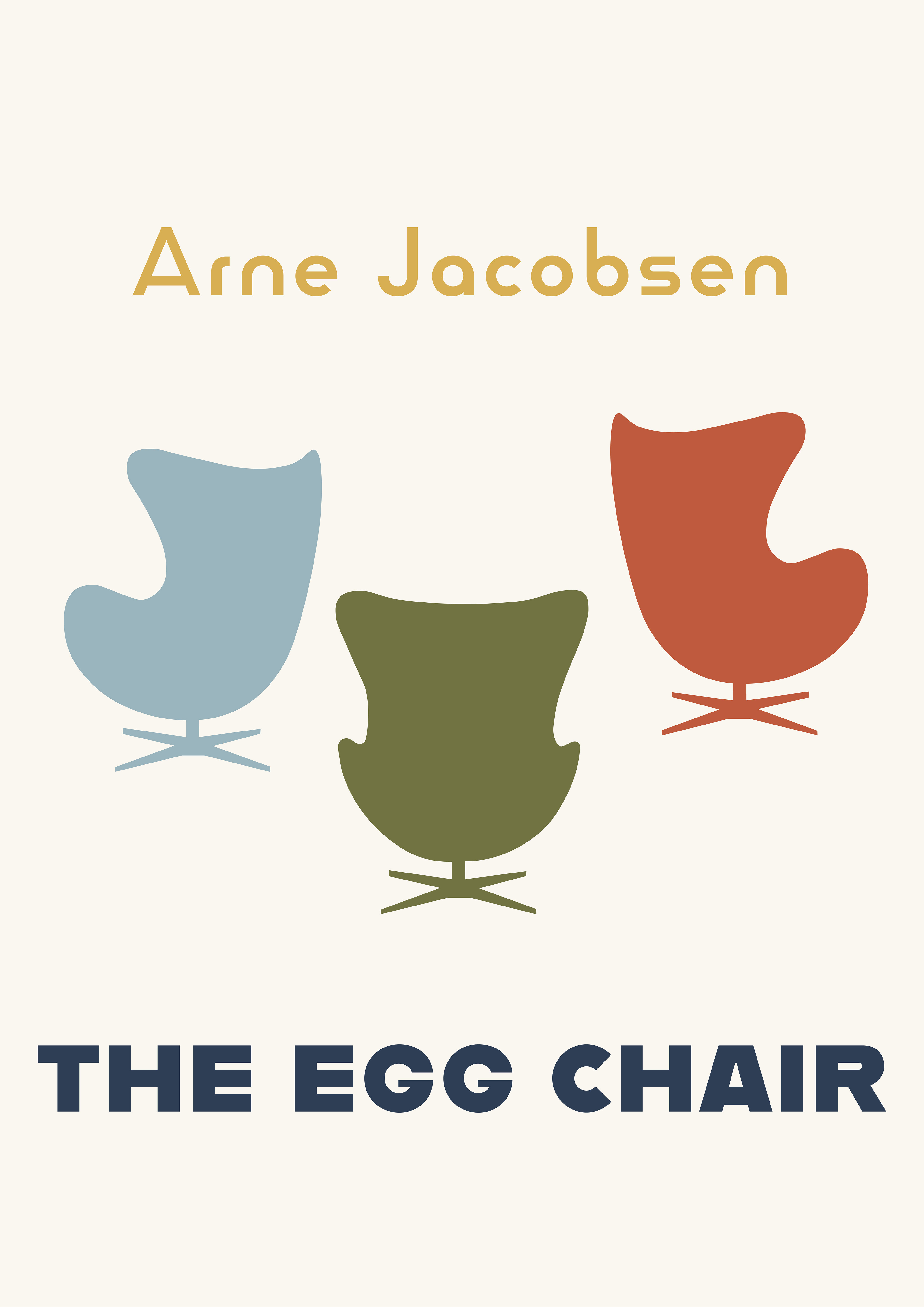
The first poster advertises the Egg Chair. I wanted the unique form of the chair to be the main focus of this poster, which is why there are no other visual elements on the poster. The accompanying fonts are products of the Bauhaus school, further establishing the connection between Jacobsen's designs and Bauhaus design through this poster.
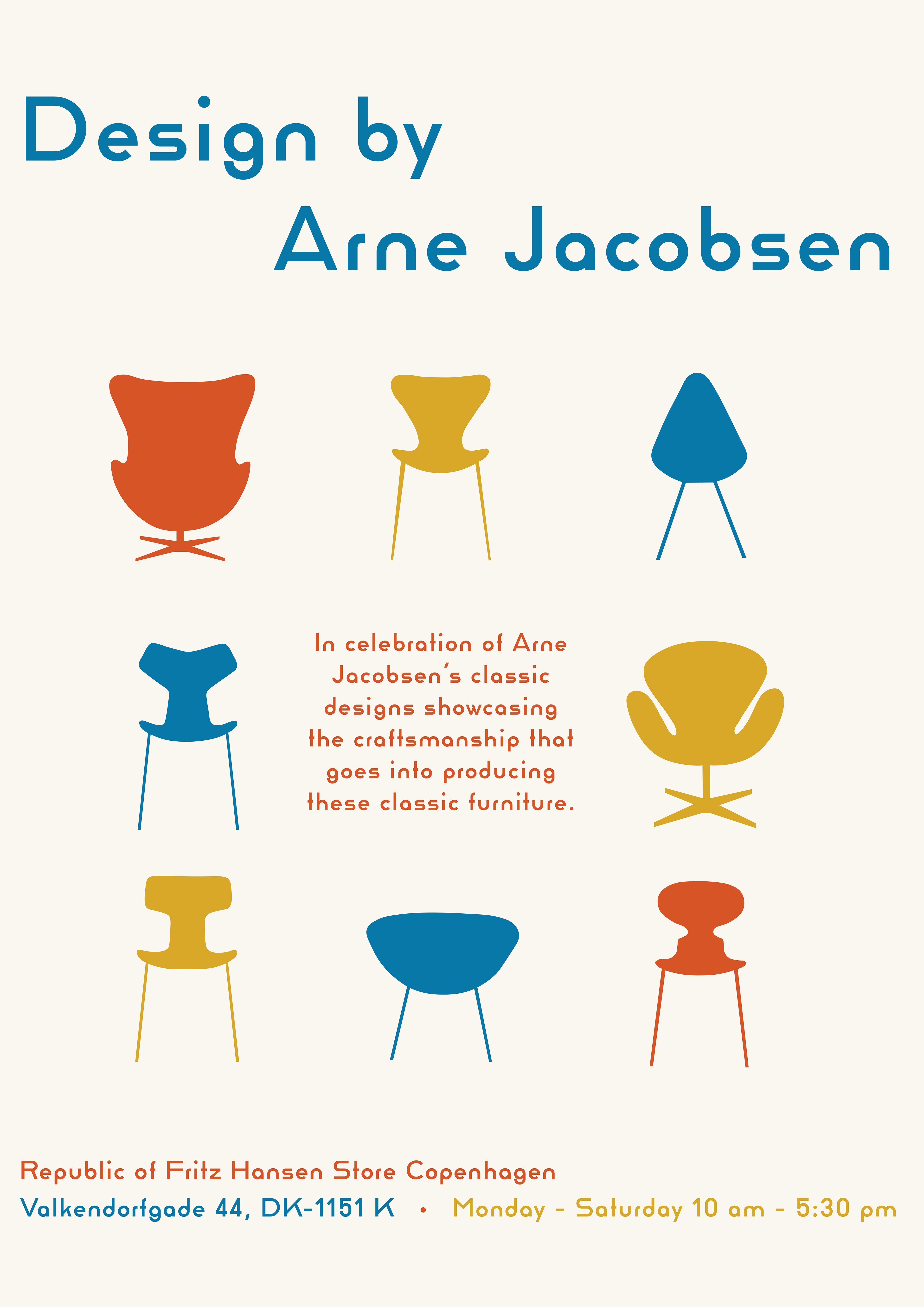
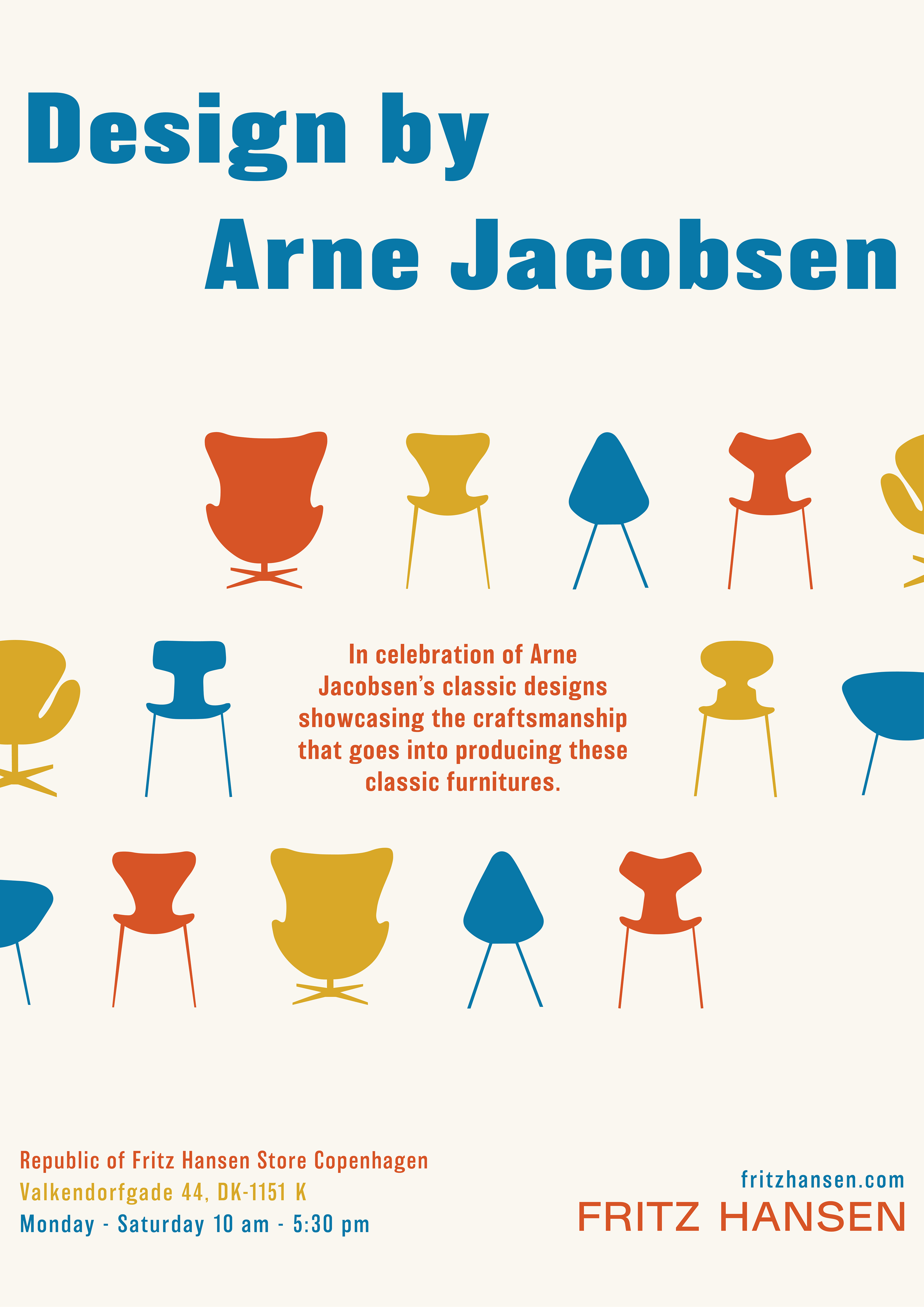
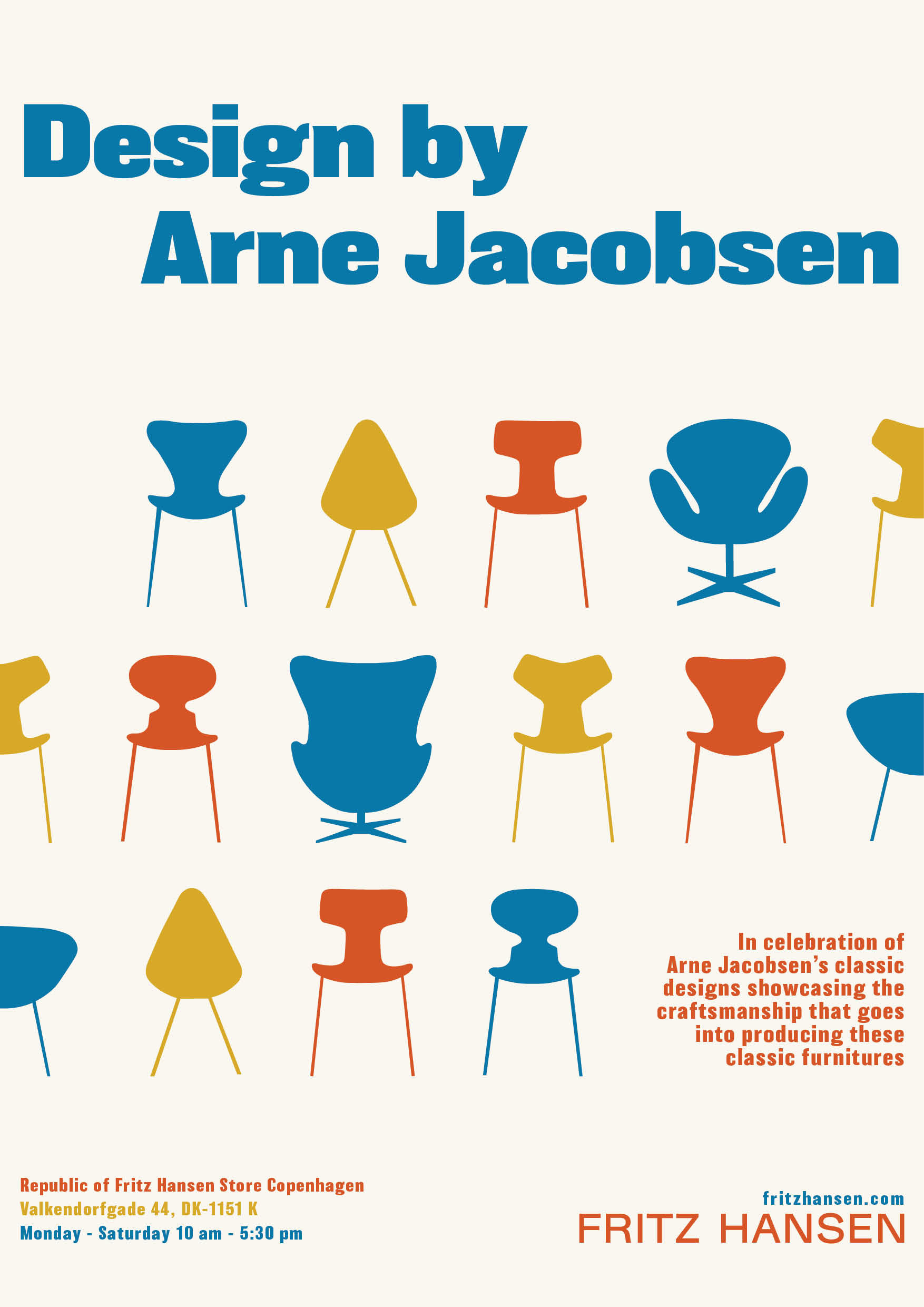
The second poster advertises an event that showcases Jacobsen's whole body of work. Similar to the first poster, I wanted the silhouettes of his chairs to be the main focus of this design, which is why I have the text pushed to the top and bottom of the page. In addition to the Egg Chair, this poster features the Ant, Series 7, Grand Prix, and Drop chairs.
poster sketches


Project Phase Two
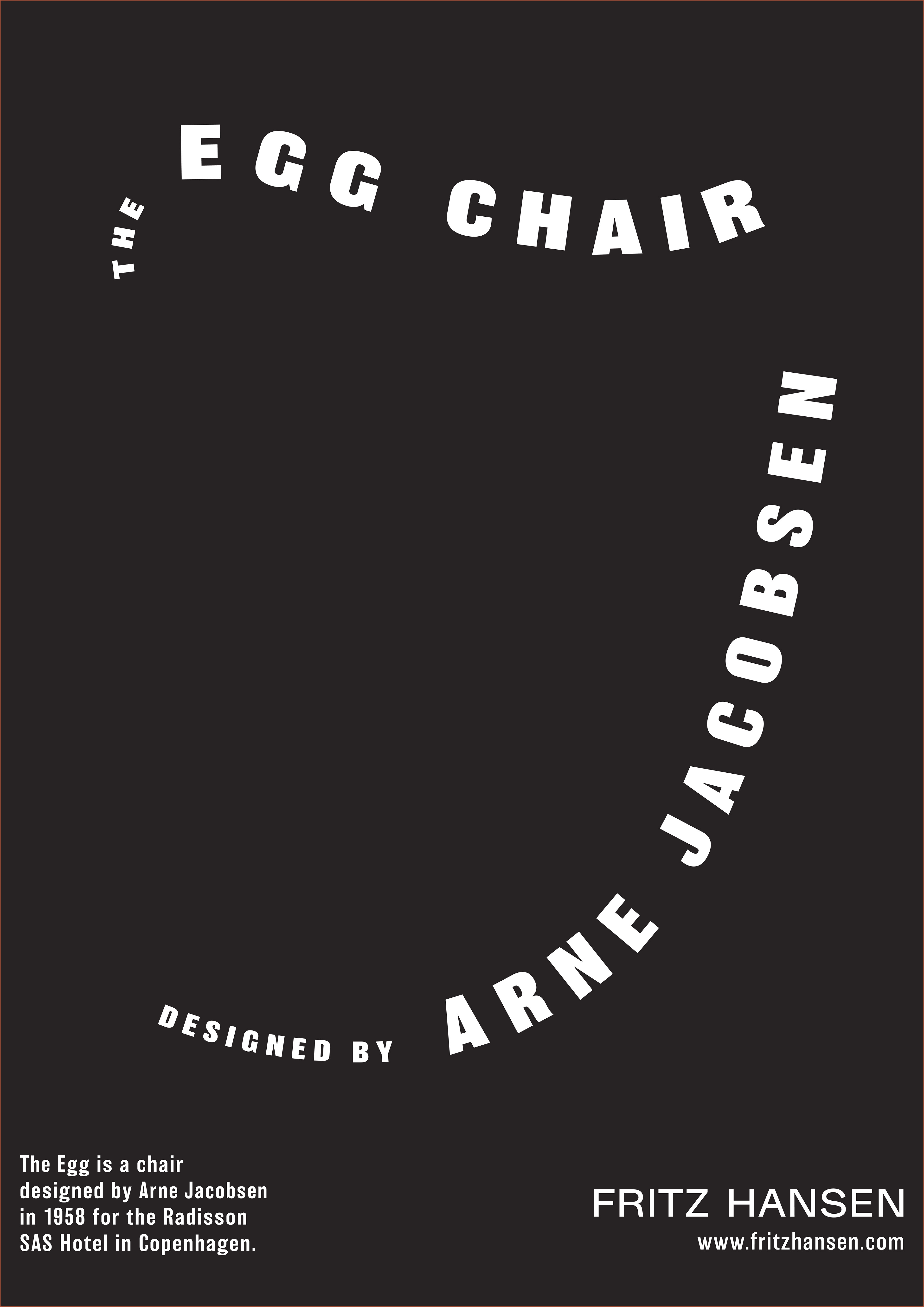
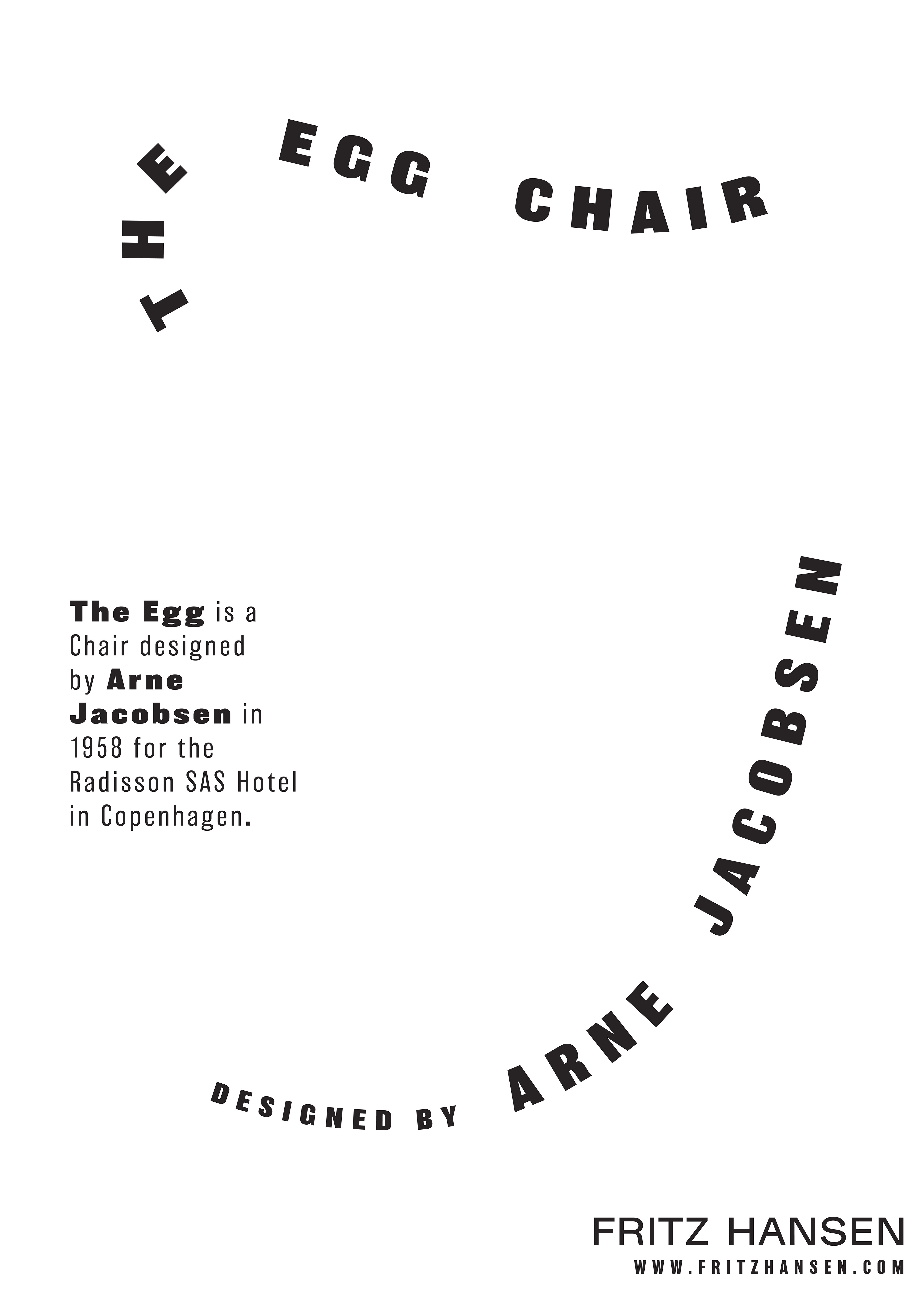
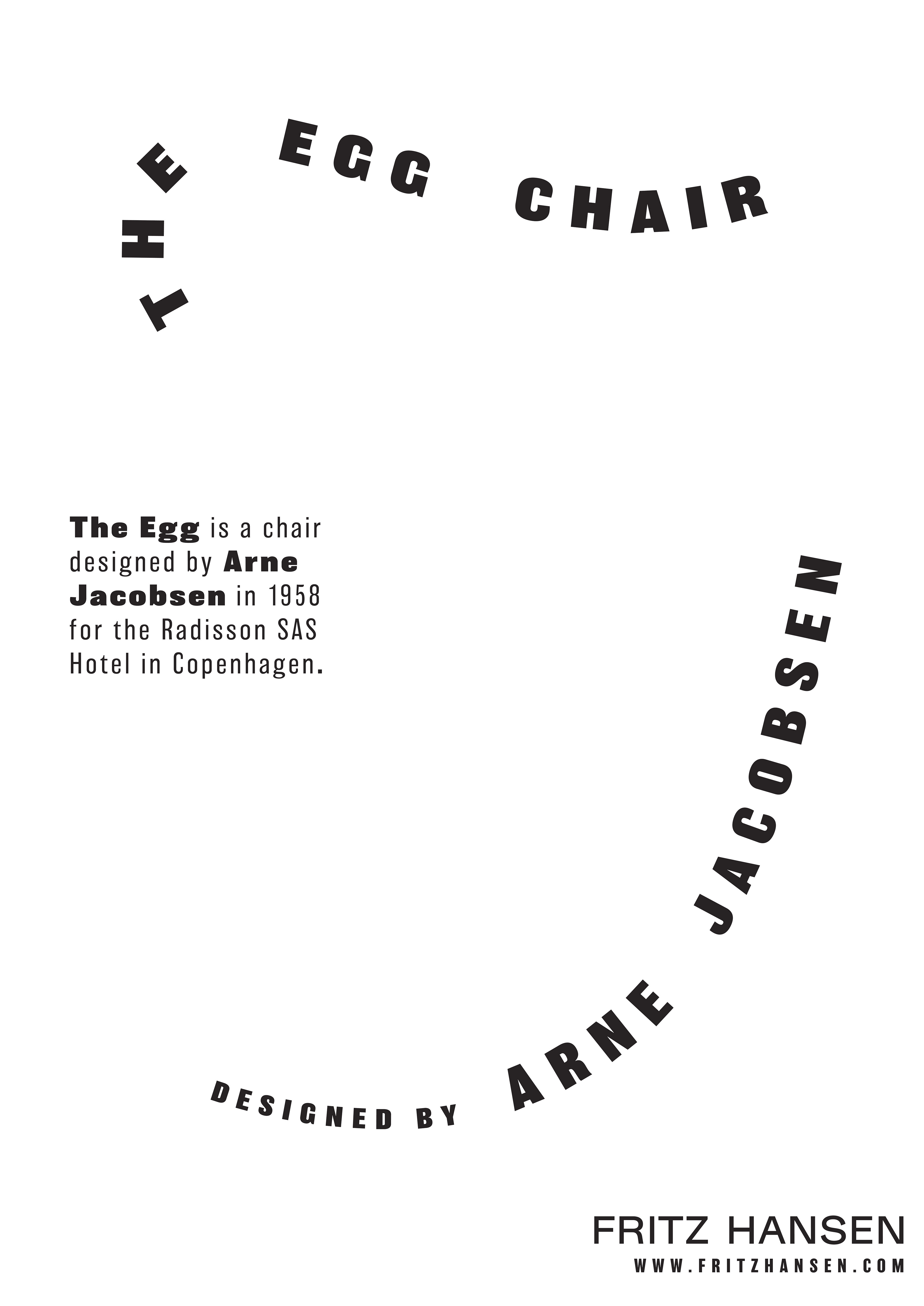
In the second phase of this project, I sought to create a second poster for the Egg Chair using only text. I arranged lines of text along the curves of the chair to suggest its form, serving as the main visual element in this poster. I chose to use only black and white for this poster to create more contrast than in earlier posters from this project.
Poster Sketches